The Conversation (0)
Getty Images/IEEE Spectrum
DarkGray
Mice, windows, icons, and menus: these are the ingredients of computer interfaces designed to be easy to grasp, simplicity itself to use, and straightforward to describe. The mouse is a pointer. Windows divide up the screen. Icons symbolize application programs and data. Menus list choices of action.
But the development of today’s graphical user interface was anything but simple. It took some 30 years of effort by engineers and computer scientists in universities, government laboratories, and corporate research groups, piggybacking on each other’s work, trying new ideas, repeating each other’s mistakes.
This article was first published as “Of Mice and menus: designing the user-friendly interface.” It appeared in the September 1989 issue of IEEE Spectrum. A PDF version is available on IEEE Xplore. The photographs and diagrams appeared in the original print version.
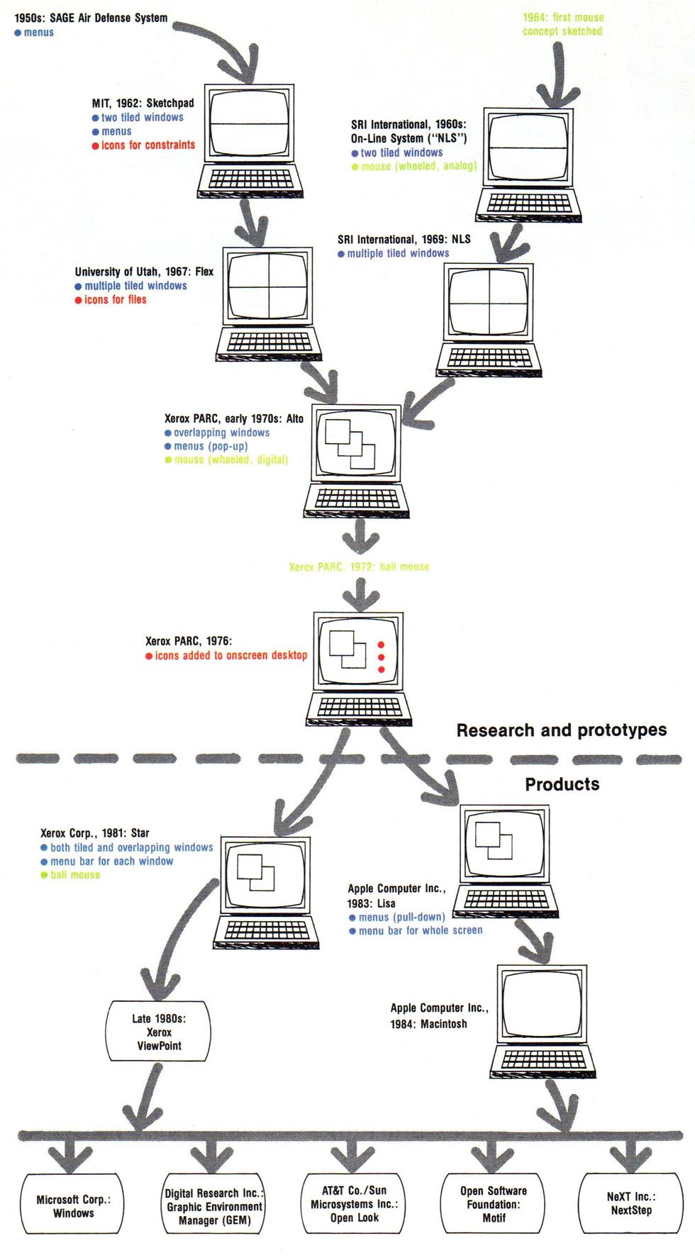
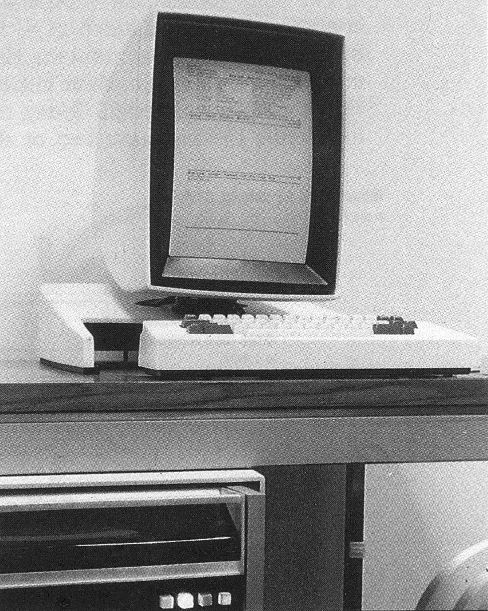
Throughout the 1970s and early 1980s, many of the early concepts for windows, menus, icons, and mice were arduously researched at Xerox Corp.’s Palo Alto Research Center (PARC), Palo Alto, Calif. In 1973, PARC developed the prototype Alto, the first of two computers that would prove seminal in this area. More than 1200 Altos were built and tested. From the Alto’s concepts, starting in 1975, Xerox’s System Development Department then developed the Star and introduced it in 1981—the first such user-friendly machine sold to the public.
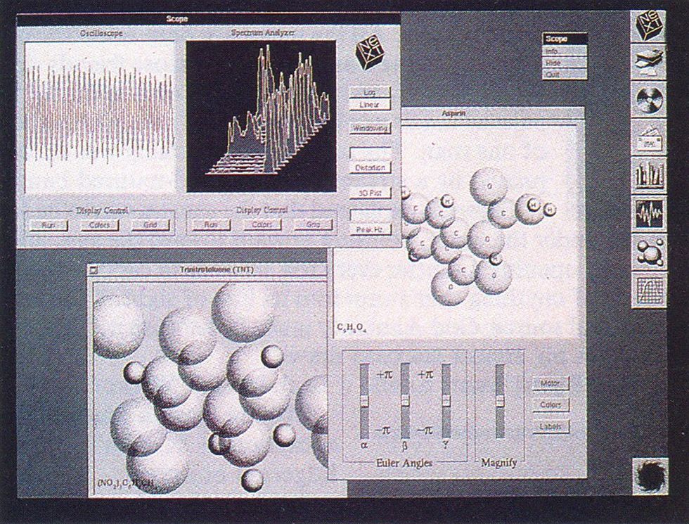
In 1984, the low-cost Macintosh from Apple Computer Inc., Cupertino, Calif., brought the friendly interface to thousands of personal computer users. During the next five years, the price of RAM chips fell enough to accommodate the huge memory demands of bit-mapped graphics, and the Mac was followed by dozens of similar interfaces for PCs and workstations of all kinds. By now, application programmers are becoming familiar with the idea of manipulating graphic objects.
The Mac’s success during the 1980s spurred Apple Computer to pursue legal action over ownership of many features of the graphical user interface. Suits now being litigated could assign those innovations not to the designers and their companies, but to those who first filed for legal protection on them.
The GUI started with Sketchpad
The grandfather of the graphical user interface was Sketchpad [see photograph]. Massachusetts Institute of Technology student Ivan E. Sutherland built it in 1962 as a Ph.D. thesis at MIT’s Lincoln Laboratory in Lexington, Mass. Sketchpad users could not only draw points, line segments, and circular arcs on a cathode ray tube (CRT) with a light pen—they could also assign constraints to, and relationships among, whatever they drew.
Arcs could have a specified diameter, lines could be horizontal or vertical, and figures could be built up from combinations of elements and shapes. Figures could be moved, copied, shrunk, expanded, and rotated, with their constraints (shown as onscreen icons) dynamically preserved. At a time when a CRT monitor was a novelty in itself, the idea that users could interactively create objects by drawing on a computer was revolutionary.
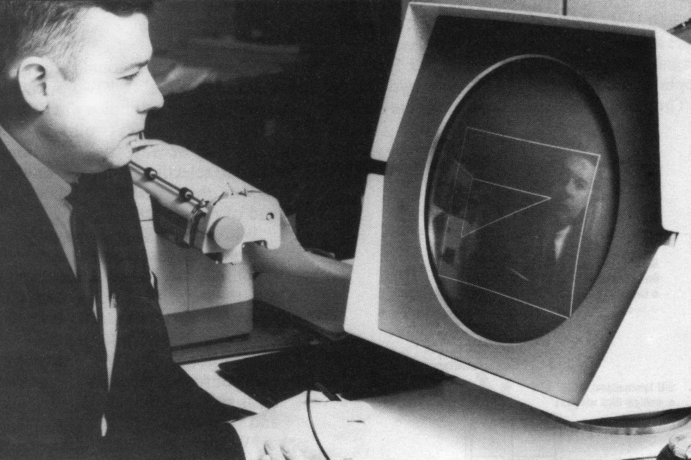
Sketchpad, created in 1962 by Ivan Sutherland at Massachusetts Institute of Technology’s Lincoln Laboratory in Lexington, is considered the first computer with a windowing interface.
The Computer Museum
Moreover, to zoom in on objects, Sutherland wrote the first window-drawing program, which required him to come up with the first clipping algorithm. Clipping is a software routine that calculates which part of a graphic object is to be displayed and displays only that part on the screen. The program must calculate where a line is to be drawn, compare that position to the coordinates of the window in use, and prevent the display of any line segment whose coordinates fall outside the window.
Though films of Sketchpad in operation were widely shown in the computer research community, Sutherland says today that there was little immediate fallout from the project. Running on MIT’s TX-2 mainframe, it demanded too much computing power to be practical for individual use. Many other engineers, however, see Sketchpad’s design and algorithms as a primary influence on an entire generation of research into user interfaces.
The origin of the computer mouse
The light pens used to select areas of the screen by interactive computer systems of the 1950s and 1960s—including Sketchpad—had drawbacks. To do the pointing, the user’s arm had to be lifted up from the table, and after a while that got tiring. Picking up the pen required fumbling around on the table or, if it had a holder, taking the time after making a selection to put it back.
Sensing an object with a light pen was straightforward: the computer displayed spots of light on the screen and interrogated the pen as to whether it sensed a spot, so the program always knew just what was being displayed. Locating the position of the pen on the screen required more sophisticated techniques—like displaying a cross pattern of nine points on the screen, then moving the cross until it centered on the light pen.
In 1964, Douglas Engelbart, a research project leader at SRI International in Menlo Park, Calif., tested all the commercially available pointing devices, from the still-popular light pen to a joystick and a Graphicon (a curve-tracing device that used a pen mounted on the arm of a potentiometer). But he felt the selection failed to cover the full spectrum of possible pointing devices, and somehow he should fill in the blanks.
Then he remembered a 1940s college class he had taken that covered the use of a planimeter to calculate area. (A planimeter has two arms, with a wheel on each. The wheels can roll only along their axes; when one of them rolls, the other must slide.)
If a potentiometer were attached to each wheel to monitor its rotation, he thought, a planimeter could be used as a pointing device. Engelbart explained his roughly sketched idea to engineer William English, who with the help of the SRI machine shop built what they quickly dubbed “the mouse.”
This first mouse was big because it used single-turn potentiometers: one rotation of the wheels had to be scaled to move a cursor from one side of the screen to the other. But it was simple to interface with the computer: the processor just read frequent samples of the potentiometer positioning signals through analog-to-digital converters.
The cursor moved by the mouse was easy to locate, since readings from the potentiometer determined the position of the cursor on the screen-unlike the light pen. But programmers for later windowing systems found that the software necessary to determine which object the mouse had selected was more complex than that for the light pen: they had to compare the mouse’s position with that of all the objects displayed onscreen.
The computer mouse gets redesigned—and redesigned again
Engelbart’s group at SRI ran controlled experiments with mice and other pointing devices, and the mouse won hands down. People adapted to it quickly, it was easy to grab, and it stayed where they put it. Still, Engelbart wanted to tinker with it. After experimenting, his group had concluded that the proper ratio of cursor movement to mouse movement was about 2:1, but he wanted to try varying that ratio—decreasing it at slow speeds and raising it at fast speeds—to improve user control of fine movements and speed up larger movements. Some modern mouse-control software incorporates this idea, including that of the Macintosh.
The mouse, still experimental at this stage, did not change until 1971. Several members of Engelbart’s group had moved to the newly established PARC, where many other researchers had seen the SRI mouse and the test report. They decided there was no need to repeat the tests; any experimental systems they designed would use mice.
Said English, “This was my second chance to build a mouse; it was obvious that it should be a lot smaller, and that it should be digital.” Chuck Thacker, then a member of the research staff, advised PARC to hire inventor Jack Hawley to build it.
Hawley decided the mouse should use shaft encoders, which measure position by a series of pulses, instead of potentiometers (both were covered in Engelbart’s 1970 patent), to eliminate the expensive analog-to-digital converters. The basic principle, of one wheel rolling while the other slid, was licensed from SRI.
The ball mouse was the “easiest patent I ever got. It took me five minutes to think of, half an hour to describe to the attorney, and I was done.”
—Ron Rider
In 1972, the mouse changed again. Ron Rider, now vice president of systems architecture at PARC but then a new arrival, said he was using the wheel mouse while an engineer made excuses for its asymmetric operation (one wheel dragging while one turned). “I suggested that they turn a trackball upside down, make it small, and use it as a mouse instead,” Rider told IEEE Spectrum. This device came to be known as the ball mouse. “Easiest patent I ever got,” Rider said. “It took me five minutes to think of, half an hour to describe to the attorney, and I was done.”
In the PARC ball mouse design, the weight of the mouse is transferred to the ball by a swivel device and on one or two casters at the end of the mouse farthest from the wire “tail.” A prototype was built by Xerox’s Electronics Division in El Segundo, Calif., then redesigned by Hawley. The rolling ball turned two perpendicular shafts, with a drum on the end of each that was coated with alternating stripes of conductive and nonconductive material. As the drum turned, the stripes transmitted electrical impulses through metal wipers.
When Apple Computer decided in 1979 to design a mouse for its Lisa computer, the design mutated yet again. Instead of a metal ball held against the substrate by a swivel, Apple used a rubber ball whose traction depended on the friction of the rubber and the weight of the ball itself. Simple pads on the bottom of the case carried the weight, and optical scanners detected the motion of the internal wheels. The device had loose tolerances and few moving parts, so that it cost perhaps a quarter as much to build as previous ball mice.
How the computer mouse gained and lost buttons
The first, wooden, SRI mouse had only one button, to test the concept. The plastic batch of SRI mice bad three side-by-side buttons—all there was room for, Engelbart said. The first PARC mouse bad a column of three buttons-again, because that best fit the mechanical design. Today, the Apple mouse has one button, while the rest have two or three. The issue is no longer 1950—a standard 6-by-10-cm mouse could now have dozens of buttons—but human factors, and the experts have strong opinions.
Said English, now director of internationalization at Sun Microsystems Inc., Mountain View, Calif.: “Two or three buttons, that’s the debate. Apple made a bad choice when they used only one.” He sees two buttons as the minimum because two functions are basic to selecting an object: pointing to its start, then extending the motion to the end of the object.
William Verplank, a human factors specialist in the group that tested the graphical interface at Xerox from 1978 into the early 1980s, concurred. He told Spectrum that with three buttons, Alto users forgot which button did what. The group’s tests showed that one button was also confusing, because it required actions such as double-clicking to select and then open a file.
“We have agonizing videos of naive users struggling” with these problems, Verplank said. They concluded that for most users, two buttons (as used on the Star) are optimal, if a button means the same thing in every application. English experimented with one-button mice at PARC before concluding they were a bad idea.
“Two or three buttons, that’s the debate. Apple made a bad choice when they used only one.”
—William English
More than 1200 of the experimental Alto, developed in 1973 by the Xerox Palo Alto Research Center, were distributed to test its windows, menus, and mouse.
Xerox Corp.
But many interface designers dislike multiple buttons, saying that double-clicking a single button to select an item is easier than remembering which button points and which extends. Larry Tesler, formerly a computer scientist at PARC, brought the one-button mouse to Apple, where he is now vice president of advanced technology. The company’s rationale is that to attract novices to its computers one button was as simple as it could get.
More than two million one-button Apple mice are now in use. The Xerox and Microsoft two-button mice are less common than either Apple’s ubiquitous one-button model or the three-button mice found on technical workstations. Dozens of companies manufacture mice today; most are slightly smaller than a pack of cigarettes, with minor variations in shape.
How windows first came to the computer screen
In 1962, Sketchpad could split its screen horizontally into two independent sections. One section could, for example, give a close-up view of the object in the other section. Researchers call Sketchpad the first example of tiled windows, which are laid out side by side. They differ from overlapping windows, which can be stacked on top of each other, or overlaid, obscuring all or part of the lower layers.
Windows were an obvious means of adding functionality to a small screen. In 1969, Engelbart equipped NLS (as the On-Line System he invented at SRI during the 1960s was known, to distinguish it from the Off-Line System known as FLS) with windows. They split the screen into multiple parts horizontally or vertically, and introduced cross-window editing with a mouse.
By 1972, led by researcher Alan Kay, the Smalltalk programming language group at Xerox PARC had implemented their version of windows. They were working with far different technology from Sutherland or Engelbart: by deciding that their images had to be displayed as dots on the screen, they led a move from vector to raster displays, to make it simple to map the assigned memory location of each of those spots. This was the bit map invented at PARC, and made viable during the 1980s by continual performance improvements in processor logic and memory speed.
Experimenting with bit-map manipulation, Smalltalk researcher Dan Ingalls developed the bit-block transfer procedure, known as BitBlt. The BitBlt software enabled application programs to mix and manipulate rectangular arrays of pixel values in on-screen or off-screen memory, or between the two, combining the pixel values and storing the result in the appropriate bit-map location.
BitBlt made it much easier to write programs to scroll a window (move an image through it), resize (enlarge or contract) it, and drag windows (move them from one location to another on screen). It led Kay to create overlapping windows. They were soon implemented by the Smalltalk group, but made clipping harder.
Some researchers question whether overlapping windows offer more benefits than tiled on the grounds that screens with overlapping windows become so messy the user gets lost.
In a tiling system, explained researcher Peter Deutsch, who worked with the Smalltalk group, the clipping borders are simply horizontal or vertical lines from one screen border to another, and software just tracks the location of those lines. But overlapping windows may appear anywhere on the screen, randomly obscuring bits and pieces of other windows, so that quite irregular regions must be clipped. Thus application software must constantly track which portions of their windows remain visible.
Some researchers still question whether overlapping windows offer more benefits than tiled, at least above a certain screen size, on the grounds that screens with overlapping windows become so messy the user gets lost. Others argue that overlapping windows more closely match users’ work patterns, since no one arranges the papers on their physical desktop in neat horizontal and vertical rows. Among software engineers, however, overlapping windows seem to have won for the user interface world.
So has the cut-and-paste editing model that Larry Tesler developed, first for the Gypsy text editor he wrote at PARC and later for Apple. Charles Irby—who worked on Xerox’s windows and is now vice president of development at Metaphor Computer Systems Inc., Mountain View, Calif.—noted, however, that cut-and-paste worked better for pure text-editing than for moving graphic objects from one application to another.
The origin of the computer menu bar
Menus—functions continuously listed onscreen that could be called into action with key combinations—were commonly used in defense computing by the 1960s. But it was only with the advent of BitBlt and windows that menus could be made to appear as needed and to disappear after use. Combined with a pointing device to indicate a user’s selection, they are now an integral part of the user-friendly interface: users no longer need to refer to manuals or memorize available options.
Instead, the choices can be called up at a moment’s notice whenever needed. And menu design has evolved. Some new systems use nested hierarchies of menus; others offer different menu versions—one with the most commonly used commands for novices, another with all available commands for the experienced user.
Among the first to test menus on demand was PARC researcher William Newman, in a program called Markup. Hard on his heels, the Smalltalk group built in pop-up menus that appeared on screen at the cursor site when the user pressed one of the mouse buttons.
Implementation was on the whole straightforward, recalled Deutsch. The one exception was determining whether the menu or the application should keep track of the information temporarily obscured by the menu. In the Smalltalk 76 version, the popup menu saved and restored the screen bits it overwrote. But in today’s multitasking systems, that would not work, because an application may change those bits without the menu’s knowledge. Such systems add another layer to the operating system: a display manager that tracks what is written where.
The production Xerox Star, in 1981, featured a further advance: a menu bar, essentially a row of words indicating available menus that could be popped up for each window. Human factors engineer Verplank recalled that the bar was at first located at the bottom of its window. But the Star team found users were more likely to associate a bar with the window below it, so it was moved to the top of its window.
Apple simplified things in its Lisa and Macintosh with a single bar placed at the top of the screen. This menu bar relates only to the window in use: the menus could be ‘‘pulled down” from the bar, to appear below it. Designer William D. Atkinson received a patent (assigned to Apple Computer) in August 1984 for this innovation.
One new addition that most user interface pioneers consider an advantage is the tear-off menu, which the user can move to a convenient spot on the screen and “pin” there, always visible for ready access.
Many windowing interfaces now offer command-key or keyboard alternatives for many commands as well. This return to the earliest of user interfaces—key combinations—neatly supplements menus, providing both ease of use for novices and for the less experienced, and speed for those who can type faster than they can point to a menu and click on a selection.
How the computer “icon” got its name
Sketchpad had on-screen graphic objects that represented constraints (for example, a rule that lines be the same length), and the Flex machine built in 1967 at the University of Utah by students Alan Kay and Ed Cheadle had squares that represented programs and data (like today’s computer “folders”). Early work on icons was also done by Bell Northern Research, Ottawa, Canada, stemming from efforts to replace the recently legislated bilingual signs with graphic symbols.
But the concept of the computer “icon” was not formalized until 1975. David Canfield Smith, a computer science graduate student at Stanford University in California, began work on his Ph.D. thesis in 1973. His advisor was PARC’s Kay, who suggested that he look at using the graphics power of the experimental Alto not just to display text, but rather to help people program.
David Canfield Smith took the term icon from the Russian Orthodox church, where an icon is more than an image, because it embodies properties of what it represents.
Smith took the term icon from the Russian Orthodox church, where an icon is more than an image, because it embodies properties of what it represents: a Russian icon of a saint is holy and is to be venerated. Smith’s computer icons contained all the properties of the programs and data represented, and therefore could be linked or acted on as if they were the real thing.
After receiving his Ph.D. in 1975, Smith joined Xerox in 1976 to work on Star development. The first thing he did, he said, was to recast his concept of icons in office terms. “I looked around my office and saw papers, folders, file cabinets, a telephone, and bookshelves, and it was an easy translation to icons,” he said.
Xerox researchers developed, tested, and revised icons for the Star interface for three years before the first version was complete. At first they attempted to make the icons look like a detailed photographic rendering of the object, recalled Irby, who worked on testing and refining the Xerox windows. Trading off label space, legibility, and the number of icons that fit on the screen, they decided to constrain icons to a 1-inch (2.5-centimeter) square of 64 by 64 pixels, or 512 eight-bit bytes.
Then, Verplank recalls, they discovered that because of a background pattern based on two-pixel dots, the right-hand side of the icons appeared jagged. So they increased the width of the icons to 65 pixels, despite an outcry from programmers who liked the neat 16-bit breakdown. But the increase stuck, Verplank said, because they had already decided to store 72 bits per side to allow for white space around each icon.
After settling on a size for the icons, the Star developers tested four sets developed by two graphic designers and two software engineers. They discovered that, for example, resizing may cause problems. They shrunk the icon for a person—a head and shoulders—in order to use several of them to represent a group, only to hear one test subject say the screen resolution made the reduced icon look like a cross above a tombstone. Computer graphics artist Norm Cox, now of Cox & Hall, Dallas, Texas, was finally hired to redesign the icons.
Icon designers today still wrestle with the need to make icons adaptable to the many different system configurations offered by computer makers. Artist Karen Elliott, who has designed icons for Microsoft, Apple, Hewlett-Packard Co., and others, noted that on different systems an icon may be displayed in different colors, several resolutions, and a variety of gray shades, and it may also be inverted (light and dark areas reversed).
In the past few years, another concern has been added to icon designers’ tasks: internationalization. Icons designed in the United States often lack space for translations into languages other than English. Elliott therefore tries to leave space for both the longer words and the vertical orientation of some languages.
More than two million of the Apple Macintosh (top), which brought the graphical user interface to personal computers, have been sold. Much of its application software is inconsistent, however: at least three different icons (bottom) can represent address files. The icons are found in Desktop Express from Dow Jones & Co., HyperCard from Apple Computer Inc., and MS Word from Microsoft Corp.
Apple Computer Inc.
The main rule is to make icons simple, clean, and easily recognizable. Discarded objects are placed in a trash can on the Macintosh. On the NeXT Computer System, from NeXT Inc., Palo Alto, Calif.—the company formed by Apple cofounder Steven Jobs after he left Apple—they are dumped into a Black Hole. Elliott sees NeXT’s black hole as one of the best icons ever designed: ”It is distinct; its roundness stands out from the other, square icons, and this is important on a crowded display. It fits my image of information being sucked away, and it makes it clear that dumping something is serious.
English disagrees vehemently. The black hole “is fundamentally wrong,” he said. “You can dig paper out of a wastebasket, but you can’t dig it out of a black hole.” Another critic called the black hole familiar only to “computer nerds who read mostly science fiction and comics,” not to general users.
With the introduction of the Xerox Star in June 1981, the graphical user interface, as it is known today, arrived on the market. Though not a commercial triumph, the Star generated great interest among computer users, as the Alto before it had within the universe of computer designers.
Even before the Star was introduced, Jobs, then still at Apple, had visited Xerox PARC in November 1979 and asked the Smalltalk researchers dozens of questions about the Alto’s internal design. He later recruited Larry Tesler from Xerox to design the user interface of the Apple Lisa.
With the Lisa and then the Macintosh, introduced in January 1983 and January 1984 respectively, the graphical user interface reached the low-cost, high-volume computer market.
At almost $10,000, buyers deemed the Lisa too expensive for the office market. But aided by prizewinning advertising and its lower price, the Macintosh took the world by storm. Early Macs had only 128K bytes of RAM, which made them slow to respond because it was too little memory for heavy graphic manipulation. Also, the time needed for programmers to learn its Toolbox of graphics routines delayed application packages until well into 1985. But the Mac’s ease of use was indisputable, and it generated interest that spilled over into the MS-DOS world of IBM PCs and clones, as well as Unix-based workstations.
Who owns the graphical user interface?
The widespread acceptance of such interfaces, however, has led to bitter lawsuits to establish exactly who owns what. So far, none of several litigious companies has definitively established that it owns the software that implements windows, icons, or early versions of menus. But the suits continue.
Virtually all the companies that make and sell either wheel or ball mice paid license fees to SRI or to Xerox for their patents. Engelbart recalled that SRI patent attorneys inspected all the early work on the interface, but understood only hardware. After looking at developments like the implementation of windows, they told him that none of it was patentable.
At Xerox, the Star development team proposed 12 patents having to do with the user interface. The company’s patent committee rejected all but two on hardware—one on BitBlt, the other on the Star architecture. At the time, Charles Irby said, it was a good decision. Patenting required full disclosure, and no precedents then existed for winning software patent suits.
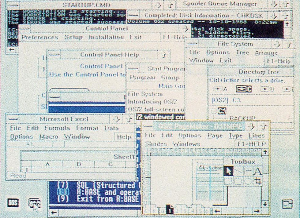
Microsoft Corp.
Today more than a dozen separate graphical user interfaces run on a variety of personal computers and workstations. The Presentation Manager component of Operating System/2, jointly developed by Microsoft Corp. and IBM Corp., is intended to run on several million IBM and compatible personal computers; this display shows that too many onscreen windows can impede clarity.
The most recent and most publicized suit was filed in March 1988, by Apple, against both Microsoft and Hewlett-Packard Co., Palo Alto, Calif. Apple alleges that HP’s New Wave interface, requiring version 2.03 of Microsoft’s Windows program, embodies the copyrighted “audio visual computer display” of the Macintosh without permission; that the displays of Windows 2.03 are illegal copies of the Mac’s audiovisual works; and that Windows 2.03 also exceeds the rights granted in a November 198S agreement in which Microsoft acknowledged that the displays in Windows 1.0 were derivatives of those in Apple’s Lisa and Mac.
In March 1989, U.S. District Judge William W. Schwarzer ruled Microsoft had exceeded the bounds of its license in creating Windows 2.03. Then in July 1989 Schwarzer ruled that all but 11 of the 260 items that Apple cited in its suit were, in fact, acceptable under the 1985 agreement. The larger issue—whether Apple’s copyrights are valid, and whether Microsoft and HP infringed on them—will not now be examined until 1990.
Among those 11 are overlapping windows and movable icons. According to Pamela Samuelson, a noted software intellectual property expert and visiting professor at Emory University Law School, Atlanta, Ga., many experts would regard both as functional features of an interface that cannot be copyrighted, rather than “expressions” of an idea protectable by copyright.
But lawyers for Apple—and for other companies that have filed lawsuits to protect the “look and feel’’ of their screen displays—maintain that if such protection is not granted, companies will lose the economic incentive to market technological innovations. How is Apple to protect its investment in developing the Lisa and Macintosh, they argue, if it cannot license its innovations to companies that want to take advantage of them?
If the Apple-Microsoft case does go to trial on the copyright issues, Samuelson said, the court may have to consider whether Apple can assert copyright protection for overlapping windows-an interface feature on which patents have also been granted. In April 1989, for example, Quarterdeck Office Systems Inc., Santa Monica, Calif., received a patent for a multiple windowing system in its Desq system software, introduced in 1984.
Adding fuel to the legal fire, Xerox said in May 1989 it would ask for license fees from companies that use the graphical user interface. But it is unclear whether Xerox has an adequate claim to either copyright or patent protection for the early graphical interface work done at PARC. Xerox did obtain design patents on later icons, noted human factors engineer Verplank. Meanwhile, both Metaphor and Sun Microsystems have negotiated licenses with Xerox for their own interfaces.
To Probe Further
The September 1989 IEEE Computer contains an article, “The Xerox ‘Star’: A Retrospective,” by Jeff Johnson et al., covering development of the Star. “Designing the Star User Interface,’’ [PDF] by David C. Smith et al., appeared in the April 1982 issue of Byte.
The Sept. 12, 1989, PC Magazine contains six articles on graphical user interfaces for personal computers and workstations. The July 1989 Byte includes ‘‘A Guide to [Graphical User Interfaces),” by Frank Hayes and Nick Baran, which describes 12 current interfaces for workstations and personal computers. “The Interface of Tomorrow, Today,’’ by Howard Reingold, in the July 10, 1989, InfoWorld does the same. “The interface that launched a thousand imitations,” by Richard Rawles, in the March 21, 1989, MacWeek covers the Macintosh interface.
The human factors of user interface design are discussed in The Psychology of Everyday Things, by Donald A. Norman (Basic Books Inc., New York, 1988). The January 1989 IEEE Software contains several articles on methods, techniques, and tools for designing and implementing graphical interfaces. The Way Things Work, by David Macaulay (Houghton Mifflin Co., Boston, 1988), contains a detailed drawing of a ball mouse.
The October 1985 IEEE Spectrum covered Xerox PARC’s history in “Research at Xerox PARC: a founder’s assessment,” by George Pake (pp. 54-61) and “Inside the PARC: the ‘information architects,’“ by Tekla Perry and Paul Wallich (pp. 62-75).
William Atkinson received patent no. 4,464,652 for the pulldown menu system on Aug. 8, 1984, and assigned it to Apple. Gary Pope received patent no. 4,823,108, for an improved system for displaying images in “windows” on a computer screen, on April 18, 1989, and assigned it to Quarterdeck Office Systems.
The wheel mouse patent, no. 3,541,541, “X-Y position indicator for a display system,” was issued to Douglas Engelbart on Nov. 17, 1970, and assigned to SRI International. The ball mouse patent, no. 3,835,464, was issued to Ronald Rider on Sept. 10, 1974, and assigned to Xerox.
The first selection device tests to include a mouse are covered in “Display-Selection Techniques for Text Manipulation,” by William English, Douglas Engelbart, and Melvyn Berman, in IEEE Transactions on Human Factors in Electronics, March 1967.
Sketchpad: A Man-Machine Graphical Communication System, by Ivan E. Sutherland (Garland Publishing Inc., New York City and London, 1980), reprints his 1963 Ph.D. thesis.
From Your Site Articles
- Larry Tesler, the Computer Scientist Who Revolutionized the User ... ›
- Kids and Us: The Story of Smalltalk - IEEE Spectrum ›
- Thirty Years Later, the Influence of the Macintosh Can Still Be Felt ... ›
- 50 Years Later, We’re Still Living in the Xerox Alto’s World - IEEE Spectrum ›
- Smalltalk Blew Steve Jobs’s Mind - IEEE Spectrum ›
- Designing the First Apple Macintosh: The Engineers’ Story - IEEE Spectrum ›
- The Lisa Was Apple’s Best Failure - IEEE Spectrum ›
Related Articles Around the Web
{"imageShortcodeIds":[]}


