If you’re a reader of the print IEEE Spectrum, perhaps you’ve noticed something different about the May edition. It has a new look, the result of a comprehensive redesign whose results will soon be seen here, on our website, as well.
This new design came from one of the best firms in the business: Pentagram. We were fortunate indeed to work with a trio consisting of partner Luke Hayman and designers Austin Maurer and Laura McNeill. In this video, an impromptu panel session organized by Spectrum executive editor Glenn Zorpette, the three designers describe some the challenges of redesigning Spectrum and reveal the thinking behind their design decisions.
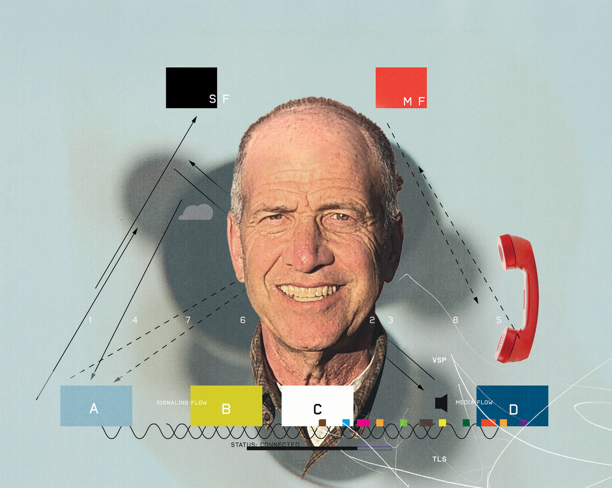
A publication redesign these days is a big, complex affair. It encompasses not just traditional, visual details such as type fonts, color palettes, and article templates, but also a myriad of others specifying the architecture of a website: how the site is designed to help a reader navigate through it and find what he or she wants in as smooth and pleasurable a manner as possible.
Designing a technology and science magazine brings unique challenges, our Pentagram team noted. “Sometimes I feel like it’s easy, at least with science and technology stuff, to go too far, and it almost becomes a caricature of itself—too futuristic,” says Maurer. “Back a couple of decades ago, people would do very futuristic-seeming things.” So for Spectrum, the team had an overarching goal: “We wanted it to feel very technical and engineering and precise, and to nod to the subject matter, but without it becoming … a caricature.”
Mission accomplished. And it wouldn’t have been possible without the IEEE New Initiatives Committee, whom we thank for its generous support of this project.
This article appears in the May 2021 print issue as “A Magazine Reborn.”
Glenn Zorpette is editorial director for content development at IEEE Spectrum. A Fellow of the IEEE, he holds a bachelor's degree in electrical engineering from Brown University.