Image: Universität Leipzig/University Hospital TübingenOn their path into the brain, neurosurgeons must preserve important nerve fibers. This team’s see-through “safety margin” around the tumor [green] could help surgeons spot those fibers. ▲
Image: University of Münster/University Hospital of MünsterThe white cylinder in this winning visualization shows one possible path to the tumor [in red]. Meanwhile, the “tumor map” at bottom left can indicate distances from the tumor’s center to important neighboring brain regions. ▲
Image: Université de SherbrookeThis psychedelic-looking brain highlights the neuronal fibers that reach the tumor [in red]. A ruler tool [blue line] indicates a distance of 6.6 centimeters from the tumor [top of ruler] to a selected critical motor area [bottom]. ▲
Image: University of Koblenz-LandauThis view gives surgeons a sneak peek through the patient’s head at the location of the tumor and the neuronal fibers that cross the path. Toggle switches (not shown) allow surgeons to change which fiber tracts are visible. ▲
Image: CMSoft/University of TohokuThe system shown here lets neurosurgeons view the brain’s neural tracts in stereoscopic 3-D. They can manipulate the image with a “3-D mouse,” such as a Nintendo Wii controller. The white spheres are the patient’s eyes. ▲
Image: Technische Universität München/ KAUST/University of Utah/University of Konstanz/DFKI SaarbrückenA tumor deforms the colorful neuronal pathways in these three images. Red corresponds to paths inside the tumor; yellow indicates paths 5 millimeters away; green, 10 mm; greenish blue, 15 mm; and blue, 20 mm. ▲
Image: The University of North Carolina at Chapel HillGreen means go. The color of the lines in this display indicate the distance from the tumor to the brain’s surface, green being the shortest distance and red the longest. ▲
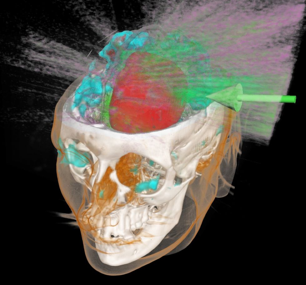
Image: University of California, DavisHere we see the brain structures surrounding the surgeon’s approach path [gray]. Magenta indicates a tumor; light coral, blood vessels; yellow, functional areas; and the tangle of rainbow colored strands are the neuronal fibers. ▲
Plotting the path to a brain tumor first requires a map. As part of next week’s VisWeek conference, the 2010 IEEE Visualization Contest pitted graphics teams from both industry and academia against one another to see who could best draw that map. Each team transformed the same sets of MRI data into unique, and sometimes bizarre, pictures of the safest paths through the brain. Neurosurgeons decided the winner.
Next year’s contest to model the turbulence from a fluid pump is already accepting submissions.
IEEE Spectrum is the flagship publication of the IEEE — the world’s largest professional organization devoted to engineering and applied sciences. Our articles, podcasts, and infographics inform our readers about developments in technology, engineering, and science.
IEEE Spectrum is the flagship publication of the IEEE — the world’s largest professional organization devoted to engineering and applied sciences. Our articles, podcasts, and infographics inform our readers about developments in technology, engineering, and science.