The Conversation (1)

Illustration: StoryTK
If you wanted to “flatten the curve” in 2019, you might have been changing students’ grades or stamping down a rug ripple. Today, that phrase refers only to the vital task of reducing the peak number of people concurrently infected with the COVID-19 virus. Beginning in early 2020, graphs depicting the expected number of infections spread through social networks, much like the virus itself. We’ve all become consumers of epidemiological models, the mathematical entities that spit out these ominous trend lines.
Such models have existed for decades but have never received such widespread attention. They’re informing public policy, financial planning, health care allocation, doomsday speculation, and Twitter hot takes. In the first quarter of 2020, government leaders were publicly parsing these computational speculations, making huge decisions about whether to shut down schools, businesses, and travel. Would an unchecked outbreak kill millions, or fizzle out? Which interventions would help the most? How sure could we be of any forecast? Models disagreed, and some people pointed to whichever curve best supported their predilections. It didn’t help that the researchers building the models were still figuring out what the heck they were doing.
There’s more than one way to model an epidemic. Some approaches are pure mathematical abstraction, just trying to get the lines right. Some re-create society in silicon, down to the person. Some combine several techniques. As modelers—a mix of computer scientists, epidemiologists, physicians, statisticians—fumble their way through the darkness of this pandemic, they pull tools off shelves, modify them, and create new ones, adapting as they learn what works and as new information emerges.
They hope, of course, to help quell the current outbreak. But their larger goal is to have tools in place to model any future disease, whether it’s a seasonal flu or the next big bug. “In some ways, forecasting epidemics was still in its infancy when this pandemic started spreading,” said biologist Lauren Ancel Meyers in June. Meyers, the head of the COVID-19 Modeling Consortium at the University of Texas at Austin, added, “And it has matured quite a bit over the last two or three months.” So what has worked—and what hasn’t?
The most common approach to modeling an epidemic is what’s called a compartmental model. You divide the population into several categories and write mathematical rules that dictate how many people move from one category to another at each tick of the model’s clock. First, everyone is susceptible. They’re in the S compartment. Then some people become infected (I), and later they’re removed (R) from the pathogen’s path, through either recovery or death. These models are sometimes called SIR models. Variations include a group that’s exposed (E) to the pathogen but not yet contagious—SEIR models. If postrecovery immunity is temporary, you might recycle recovered people back to S, making it an SIRS (or SEIRS) model. At its most basic, the model is a handful of numbers indicating how many people are in each compartment, plus differential equations governing the transitions between compartments. Each equation has adjustable parameters—the knobs that set the flow rates.
SEIRS Model
A SEIRS model puts people into categories: susceptible (S), exposed (E), infected (I), removed from the susceptible population (R), and potentially back to susceptible (S) again, depending on whether a recovered person has immunity from the disease. The modeler’s job is to define the equations that determine how people move from one category to the next. Those equations depend on a wide variety of parameters drawn from biology, behavior, politics, the economy, the weather, and more.
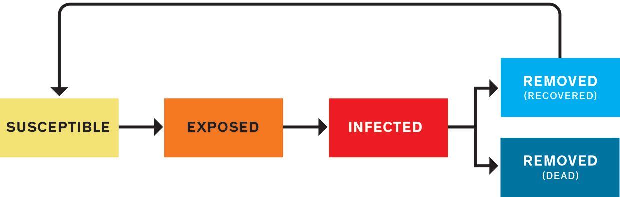
A graph over time of the removed (R) population usually resembles a sigmoid or elongated S-curve, as the numbers of dead or recovered rise slowly at first, then more steeply, then gradually plateau. The susceptible population (S) follows the same trend but downward, falling slowly, then quickly, then slowly. Around where the lines cross, at their steepest sections, the line for currently infected (I) forms a hump. This is the curve we want to flatten, lowering the hump’s peak and stretching it out, to lighten the load on hospitals at any given time.
Forecasting the shapes of these lines requires getting the equations right. But their parameters—which can change over time—depend on such varied factors as biology, behavior, politics, the economy, and the weather. Compartmental models are the gold standard, says Sunetra Gupta, an epidemiologist at the University of Oxford, but “it’s a question of what do you strap onto it.”
A prominent group employing a compartmental model is the Institute for Health Metrics and Evaluation (IHME), at the University of Washington, in Seattle. The team actually started out early in the pandemic with a completely different approach called a curve-fitting model. Because the outbreak in the United States lagged behind those in some other countries, this model assumed that the U.S. curve would resemble those prior curves. According to Theo Vos, an epidemiologist at the University of Washington, the aim was to predict the peak in hospital use with curves for China, Italy, and Spain. In late March, with just a few thousand cumulative deaths in the United States, the IHME accurately predicted a rise to about 50,000 over the next four weeks. By April, policymakers and the media were lavishing the IHME model with attention. Dr. Deborah Birx, the White House’s Coronavirus Response Coordinator, and her team talked with the IHME group almost daily.
But the U.S. curve didn’t flatten as quickly as the IHME model anticipated. In mid-April, for example, it predicted that the death toll would reach 60,000 in mid-May, while the actual number turned out to be around 80,000. As the weeks went on, the model began to garner harsh criticism from some epidemiologists and biostatisticians for failing to account for all sources of uncertainty, and for being based on the unlikely assumption that social-distancing policies would be as extensive and effective in the United States as they were in other countries. (Vos notes, “If you read our documentation that we published on our website with model results at the time, you will see that this assumption was clearly stated.”) By the end of April, IHME director Christopher Murray was admitting that his model was “orders of magnitude more optimistic” than others, while still defending its usefulness. In early May, the IHME team added an SEIR model as a central component of their continually evolving system.
Instead of manually defining the parameters in their SEIR equations, the team let computers do it, using Bayesian statistical methods, which estimate the likelihood of various causes for a given outcome. The group regularly receives statistics on COVID-19’s course: how long it’s taking people to show symptoms, how many people are reporting to hospitals, how many people are dying. They also collect data on factors such as mask wearing (from online surveys) and, as a proxy for social distancing, mobility (from anonymized phone location tracking).
To tune the SEIR model, the system tests different model parameters to see which ones result in predictions that best match the recent data. Once the best parameters are chosen, the SEIR model uses them, along with expected changes in the other inputs, to forecast infections and deaths over the next several months. Bayesian techniques incorporate uncertainty, so the model runs a thousand times with slightly different control-knob settings, creating a range of possible outcomes.
One of the most important knobs is reproduction number, or R (not the same as the R in SEIR). R is the number of people each infected person is expected to infect. Typically, if R is above 1.0, the early epidemic grows exponentially. Below 1.0, it fades away. “We learned how to tame an SEIR model,” Vos says. “They’re very reactive to small changes. The tendency is to go exponential.” In a completely abstract model, slight differences in parameters such as R can cause wildly different outcomes, unbound by real-world social and environmental contingencies. Without using statistics to ground parameter setting in hard data, Vos says, “your cases go completely bonkers.”
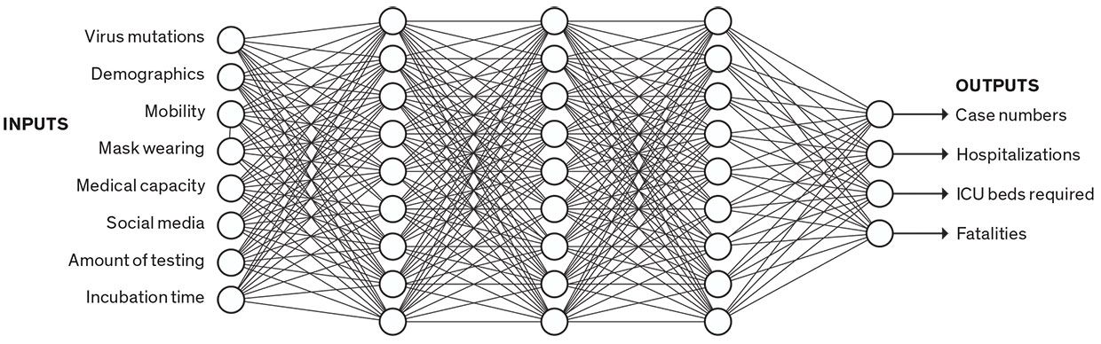
Data-Driven Model
Data-driven models don’t sort people into categories; they just crunch numbers. Some data-driven models use neural networks. In this simplified example, a trained neural network infers complex relationships among a broad set of inputs to predict certain outputs. A neural network is a “black box,” as the modeler can’t know or understand the thousands of parameters being used in the prediction.
Others have also combined compartmental models with machine learning. One model called YYG has done well on a hub that feeds forecasts to the U.S. Centers for Disease Control and Prevention (CDC). The YYG model is run solely by an independent data scientist with a master’s degree in computer science from MIT named Youyang Gu. His model is very simple: The only data it uses is daily deaths. From this statistic, it sets parameters—including reproduction number, infection mortality rate, and lockdown fatigue—using a grid search. For each parameter, it considers several options, and it tests every possible combination before choosing the set that best matches the data. It’s like mixing and matching outfits—now let’s try the red shirt with the green pants and yellow socks.
“I was frustrated at the quality of the models back in early April and late March,” Gu says. “Back then, one of the most frequently cited models in the media”—the IHME curve-fitting model—“had deaths going to zero by June. When I looked at the data, I could not see how that was possible, so I just wanted to take my own shot.” By 9 May, when the U.S. death toll almost exactly matched Gu’s prediction of 80,000 by that date, the physician and public-health leader Eric Topol praised the YYG model as “the most accurate #COVID19 model.”
“We’ve shown that a very simple model like ours can do a good job,” Gu says. One benefit of simplicity is agility, he adds: He forecasts 50 states and 70 countries, all in under 30 minutes on his laptop. “Because it’s so simple, it allows me to make changes quickly.” In addition, simpler models with fewer parameters are more likely to generalize to new situations and can also be easier to understand.
One alternative to SEIR models is data-driven models. These churn through data without explicitly accounting for separate categories of people, explains B. Aditya Prakash, a computer scientist at Georgia Tech. His team uses a set of deep-learning models—large neural networks, with tens of thousands of parameters. These networks infer complex relations between input data (such as mobility, testing, and social media) and pandemic outcomes (such as hospitalizations and deaths).
Prakash points out that data-driven models can be good for predicting “composite signals, signals which don’t have a clear epidemiological counterpart.” For instance, if you’re predicting medical visits, that’s a “noisy” signal that depends on not only the number of infections but also all the social and economic factors that might make someone visit a doctor or stay at home. But he concedes that compartmental models are better than deep-learning models for exploring hypotheticals—if we could enact policies that reduced R (reproduction number) by 20 percent, would that change the curve much?—because the model’s control knobs are more visible. And since SEIR models rely on epidemiological theory, they can make longer-term predictions. Deep learning is more tied to the data, so it can be more accurate in the short term, but it’s a black box, with thousands of incomprehensible parameters that are determined by the learning process—so it’s hard to know how well it will extrapolate to other situations or the distant future.
While data-driven models occupy the abstract number-crunching end of the modeling spectrum, the opposite, hyperrealistic end is marked by agent-based models. These are much like the video game The Sims. Each individual in a population is represented by their own bit of code, called an agent, which interacts with other agents as it moves around the world. One of the most successful agent-based models was designed at the University of Sydney. The model has three layers, beginning with a layer of demographics. “We’re essentially creating a digital twin for every person represented in the census,” said Mikhail Prokopenko, a computer scientist at the university. He and his colleagues built a virtual Australia comprising 24 million agents, whose distribution matches the real thing in terms of age, household size, neighborhood size, school size, and so on. The second layer is mobility, in which agents are assigned to both a household and a school or workplace. On top of demographics and mobility, they add the disease, including transmission rates within households, schools, and workplaces, and how the disease progresses in individuals. In 2018, the group published a similar model for the flu that used older census data. They were building an updated model for further flu studies when the COVID-19 epidemic broke out, so they pivoted to capture its distinctive characteristics in their disease-transmission layer.
Agent-Based Model
In agent-based models, a simulated world accounts for the actions of all the people in a given population. Researchers at the University of Sydney created a COVID-19 model with three layers: demographics, with a digital twin for every person counted by the census; mobility, with the agents moving among households and schools and offices; and the characteristics of the disease.
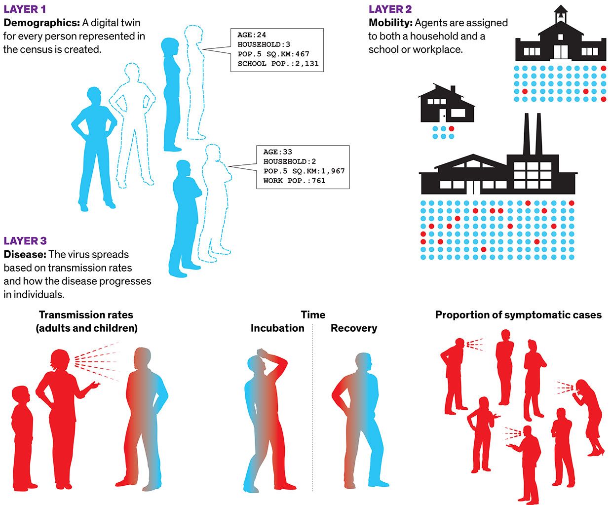
When set in motion, the model ticks twice a day: People come in contact at school or work in the daytime, then at home at night. It’s like throwing dice over and over. The model covers 180 days in a few hours. The team typically runs tens or hundreds of copies of the model in parallel on a computing cluster to generate a range of outcomes.
The biggest insight reported by the Sydney group was that social distancing helps very little if only 70 percent of people practice it, but successfully squashes COVID-19 incidence if 80 percent of people can manage it over a span of a few months. And 90 percent compliance achieved the same effect in a faster time frame. The model informed both a report to the federal government from the Group of Eight Australian universities, and two reports from the World Health Organization. “We’re all pleased,” Prokopenko says, “that an agent-based model—which we’ve been trying to advocate for so long—at the time of need did a good job.”
Prokopenko says SEIR models have done a “rough job” in Australia, where some forecasts have been off by orders of magnitude. Further, they help you explore hypotheticals but don’t tell you exactly how to intervene. Let’s say the SEIR model tells you that reducing R by 20 percent will cut the speed of the pandemic’s spread in half. But how do you reduce R by 20 percent in the real world? With agent-based models, you can make everyone stay home one day a week and see the predicted effects of that policy.
To date, agent-based models haven’t been used extensively—possibly because they require massive computation power that hasn’t been widely available until recently. Also, they’re hard to calibrate. The Sydney model only started matching reality once the team made the ratio of ill people who were symptomatic much lower in children than in adults—one of COVID-19’s stark differences from flu. “Now that we have the technology and expertise to deploy large-scale agent-based models,” Prokopenko said, “it might make a real difference for the next pandemic.”
Researchers say they’ve learned a lot of lessons modeling this pandemic, lessons that will carry over to the next.
The first set of lessons is all about data. Garbage in, garbage out, they say. Jarad Niemi, an associate professor of statistics at Iowa State University who helps run the forecast hub used by the CDC, says it’s not clear what we should be predicting. Infections, deaths, and hospitalization numbers each have problems, which affect their usefulness not only as inputs for the model but also as outputs. It’s hard to know the true number of infections when not everyone is tested. Deaths are easier to count, but they lag weeks behind infections. Hospitalization numbers have immense practical importance for planning, but not all hospitals release those figures. How useful is it to predict those numbers if you never have the true numbers for comparison? What we need, he said, is systematized random testing of the population, to provide clear statistics of both the number of people currently infected and the number of people who have antibodies against the virus, indicating recovery. Prakash, of Georgia Tech, says governments should collect and release data quickly in centralized locations. He also advocates for central repositories of policy decisions, so modelers can quickly see which areas are implementing which distancing measures.
Researchers also talked about the need for a diversity of models. At the most basic level, averaging an ensemble of forecasts improves reliability. More important, each type of model has its own uses—and pitfalls. An SEIR model is a relatively simple tool for making long-term forecasts, but the devil is in the details of its parameters: How do you set those to match real-world conditions now and into the future? Get them wrong and the model can head off into fantasyland. Data-driven models can make accurate short-term forecasts, and machine learning may be good for predicting complicated factors. But will the inscrutable computations of, for instance, a neural network remain reliable when conditions change? Agent-based models look ideal for simulating possible interventions to guide policy, but they’re a lot of work to build and tricky to calibrate.
Finally, researchers emphasize the need for agility. Niemi of Iowa State says software packages have made it easier to build models quickly, and the code-sharing site GitHub lets people share and compare their models. COVID-19 is giving modelers a chance to try out all their newest tools, says Meyers, of the University of Texas. “The pace of innovation, the pace of development, is unlike ever before,” she says. “There are new statistical methods, new kinds of data, new model structures.”
“If we want to beat this virus,” Prokopenko says, “we have to be as adaptive as it is.”
This article appears in the October 2020 print issue as “The Mess Behind the Models.”
From Your Site Articles


