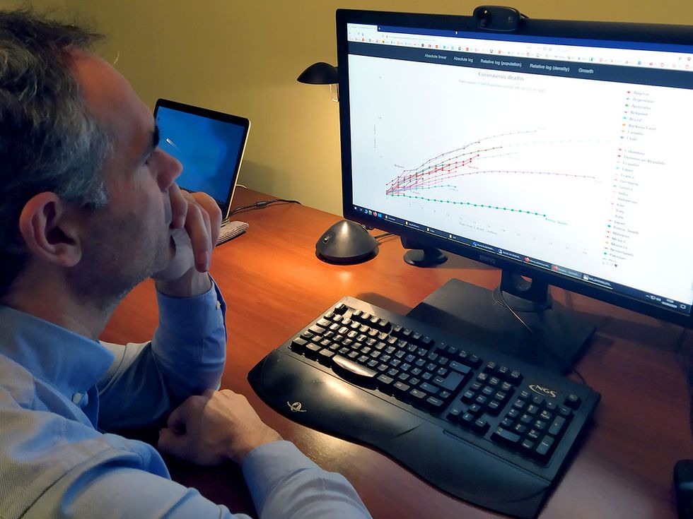
 Ruben Usamentiaga Fernandez studies the website he has created to visualize COVID-19 tracking data from JHU CSSE.Photo: Silvia Ruiz
THE INSTITUTE Ruben Usamentiaga Fernandez has created a website that takes data from the Johns Hopkins University Center for Systems Science and Engineering (JHU CSSE) and presents it in the form of interactive graphs. The IEEE senior member, who lives in Gijón, Spain, updates the website daily.
The Institute asked Usamentiaga Fernandez about his project.
This interview has been edited and condensed for clarity.
What problem are you trying to solve?
Information is key to understanding the complex situation of the pandemic, and we need to lay the foundation for accurate decision-making. The problem I am trying to solve is presenting the most relevant information about the evolution of the disease through interactive graphs. The goal is to create scientifically accurate plots about the evolution of the COVID-19 according to the data provided daily by the JHU CSSE.
What technologies are you using?
A Web application parses the data and creates plots using the available information about COVID-19 related deaths. Technologies used include the programming tools C#, ASP.NET CORE, and JavaScript.
Explain how your projects works.
Data is downloaded from the JHU CSSE and processed daily. When the system is processing the data and creating the graph, other information—such as country population and density—is considered. Axes on the graph are adjusted to provide the clearest visualization possible with the origin being the day the virus spreads through the country.
What challenges have you faced, and how did you overcome them?
The data presented cannot be completely accurate because there are clear indications that some countries are reporting false information. This can be seen in the plots, as most countries follow the same evolution but there are some outliers, such as China. For example, data analysis shows how China’s death figures are not consistent with other countries.
What is the potential impact of the technology?
Better visualization, interpretation, and improved decision-making, which are important to any citizen, not just policy makers.
How close are you to the final product?
The application has already been deployed on GitHub.
How can other IEEE members get involved?
The source code is available to IEEE members for free. Contributions are welcome.
Attention IEEE members: are you part of a team responding to the COVID-19 crisis? We want to hear from you! Wherever you are and whatever you are doing, if you are helping deal with the outbreak in some way, let us know. Send us accounts of anywhere from 200 to 800 words, or simply give us a rough idea of what you are doing and your contact information. Write to: k.pretz@ieee.org