Perhaps the most celebrated graphic image of all time was published in 1869 by Charles Joseph Minard, a French civil engineer. He traced the advance of Napoleon's army into Russia and its retreat from 1812 to 1813 by a sequence of thinning bands representing the total number of men. Four hundred twenty-two thousand soldiers crossed eastward into Russia, 100,000 reached Moscow, and 10,000 crossed the Neman River westward to Prussia, at which point the Grand Armée had lost 97.6 percent of its initial force.
A similar graphic technique was employed by a committee of Britain's Institution of Civil Engineers in its 1897–98 report on thermal efficiency in steam engines. The graphic illustrated the operation of the Louisville-Leavitt pumping steam engine by beginning with the combustion of coal on the boiler's grate, producing 193,708 kilojoules (183,600 British thermal units) per minute, continuing with the 149,976 kJ per minute that actually reached the engine, and ending with the effective work (brake horsepower) of 26,788 kJ per minute, for an overall efficiency of only 13.8 percent. Soon this representation became known as a Sankey diagram, after Matthew Henry Phineas Riall Sankey, the honorary chairman of the committee.
One of the most revealing uses of Sankey diagrams is to trace national energy flows, starting on the left with all primary energy inputs—all fossil fuels and biofuels, together with electricity generated from hydro, nuclear, wind, solar and geothermal sources—and ending on the right with actual energy services (industrial heat, kinetic and chemical energies, residential and commercial heating and air-conditioning, all forms of transportation). A set of these graphs is available for the United States for 1950, 1960, 1970, and then for every year from 1978 through 2019; they can be downloaded from two Lawrence Livermore National Laboratory websites. The latest Sankey diagram, for 2019, shows that the nation's useful energies (energy services) added up to 32.6 percent of the total primary energy input, a considerably poorer performance than in 1950, when the overall mean was 50.8 percent!
U.S. National Energy Flow
This Sankey diagram traces the U.S. energy budget as a system of rivers and tributaries. Note that electricity generation has the most diversified sources, transportation the least, and that for every joule that is used, more than two joules go to waste.
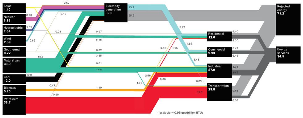
Two realities explain this retrogression. First, transportation has taken a larger share of the energy budget. The average efficiency of car engines has been improving since the mid-1970s, and flying has seen even more impressive efficiency gains per passenger-kilometer. However, rising car ownership, heavier vehicles, much more frequent flying, and longer distances traveled per year per capita explain the sector's higher share of final energy use (37 percent in 2019, 30 percent in 1950) and its slight efficiency drop from 26 percent to 21 percent during the past 70 years.
The second reality is the decline in the average conversion efficiency of residential and commercial energy use, from about 70 percent to 65 percent, as the gains from more efficient heating have been more than erased by the mass adoption of air-conditioning. Electricity for air-conditioning comes mostly from fossil-fuel-powered plants with their considerable inherent conversion losses: In 2019, the average efficiency of U.S. electricity-generating coal-fired plants was about 32 percent and that of the now-dominant gas-fired stations 44 percent.
The decline of average conversion efficiency has been much more pronounced in the industrial sector, from 70 percent to 49 percent, which is explained largely by the sector's ongoing electrification (which displaced former direct fuel uses) and by the expansion of electricity-intensive manufacturing. This is a common paradox that has accompanied improved design and higher efficiency of individual energy converters: Even as their specific performance gets better, the overall performance gets worse. The United States is now wasting significantly more energy than it did a lifetime ago. About two-thirds of the total primary input go directly into heating the universe without performing first any useful work, and only a third provides desired energy services, while in 1950 it was a 50/50 split. Another example of progressing by regressing.
This article appears in the February 2021 print issue as “Energy-Conversion Efficiency Is Falling."