The Conversation (0)

MIcroSoft
If you’re reading this article on your computer, there’s a good chance you won’t get all the way to the end. Not because you won’t find it utterly fascinating (trust me!), but because it will be hard on your eyes.
It’s not sentimentality that makes most people prefer reading books and magazines to squinting at their laptops. The quality of computer text is awful. It doesn’t have to be.
The chief problem is the low resolution of computer screens. The color LCD screens on most laptops and desktops today have a resolution of only about 100 pixels per inch. You need at least two or three times that many pixels to begin to approach the quality of the printed page. The output of even a cheap laser printer is six times as good.
What’s more, screen resolutions have hardly budged in the last several years, for a variety of reasons. For one, you’d need a lot more computational power to make a difference you could easily see on your screen. Moving from 100 ppi to 200 ppi, for instance, means your computer would have four times as many pixels to fill, and that in turn would probably bog down your graphics processor or, in a laptop, quickly drain your battery. Moore’s Law will eventually give us faster chips, and new integrated-circuit designs are getting more power-efficient. But making computer displays with higher pixel densities is also costly, because you’re more likely to get dead pixels during manufacturing.
The resolution gap didn’t matter much in the days when most people never had to read long or detailed material on their computers. But that option is becoming less and less realistic, as publishers, companies, and other organizations increasingly turn to the Web to put out their articles, manuals, and other original content. Of course, many people can and do print the material before reading it. But that’s not a very efficient option, and it’s at odds with longer-term trends in publishing (to say nothing of longer-term trends in forestry).
Analysts envision that in coming years, readers will download more and more text to compact, handheld devices, enjoying instant, inexpensive, mobile, and customized access to news, books, e-mail, reviews, directions, and all the other tidings of everyday life. In other words, we’ll all be spending more and more time reading onscreen.
As it is, the average office worker already spends the better part of the workday at the computer. It makes good economic sense, then, to improve the reading experience. Jakob Nielsen, the Web usability guru, has calculated that boosting a worker’s onscreen reading speed by just 10 percent would save his or her employer about US $2000 each year, through added productivity.
So, given that the need for a better onscreen reading experience is there, but not the pixel density, what’s to be done? Plenty. Research groups like the Advanced Reading Technologies team at Microsoft, of which I’m a member, are working hard on the problem. Type designers, cognitive psychologists, and computer scientists and engineers are collaborating to figure out ways to present text that is both aesthetically pleasing and easy to read and comprehend. The secret to better computer text, it turns out, is a heady mixture of art, science, and technology.
You may not even realize how much time you spend reading from your computer screen. You might be surfing the Web, scanning e-mail, composing a report, filling in a spreadsheet, or writing software, but what you’re really doing is reading. In fact, reading is probably the task we perform most frequently on computers. Spend too much time staring at your monitor, though, and the inevitable happens: your eyes hurt, your head aches, and your thoughts may even fog up. Eventually, you reach a point where you can’t read any further.
What is the longest document that you’re willing to read on screen? Five years ago, many people would print out anything longer than a page. These days, they may read on for several pages without feeling the need to print. The way text is presented onscreen has gotten better—not perfect, or even very good, but better.
One of the main improvements is in type design. Over centuries, type designers came up with an assortment of visual tricks to appeal to the human eye and get people to keep reading. One key quality they strive for is symmetry. Readers will perceive letters and words that aren’t symmetrical as ugly—even if they don’t notice this asymmetry consciously, it will still degrade their reading experience on some level. To achieve a symmetrical look, font designers try to keep the stem widths of letters and the spacing between letters as even as possible.
Designers also have tricks for specific letters. In grade school, for example, you were probably taught that capitals are supposed to reach from the baseline to the capital line and no further. But type designers usually ignore this rule. Rounded letters—such as O, C, and Q—often reach above the capital line and below the baseline. Without that extra padding, those letters would look smaller than the rest.
Or take the letter X. What could be simpler than those two intersecting diagonals? But a typed X with perfectly straight lines looks strange—specifically, the top right arm will appear misaligned with the lower left leg. To compensate, type designers shift the top right arm slightly downward to give the appearance that it’s in line with the left leg.
Back when typesetting was still done by hand, letter by letter, and space by space, designers rendered such tricks in metal dies. When personal computers came along, the cramped, low-resolution monochrome CRT monitors didn’t allow for much nuance in type design, and reading from those early screens was pretty grueling.
In the 1980s, with the advent of graphical user interfaces and desktop publishing, things started to improve. Of course, taking typographic rules that had been developed over centuries for the printed page and rendering them in pixels on the screen wasn’t, and still isn’t, straightforward. At first, font producers represented each letter with a unique bitmap—essentially, a bunch of rows and columns of pixels that were either on or off. A digital font consisted of thousands of these bitmaps for every letter, number, and symbol and for every point size, style, and resolution. The Japanese font set MS Mincho, for example, contains about 128 000 embedded bitmaps.
Today’s computer fonts are more streamlined. Rather than individual bitmaps, they rely on scalable outlines of each letter. To display a letter onscreen, the font software running on your microprocessor takes the letter outline, automatically scales it up or down to the desired size, and then creates a bitmap of the letter on the fly. It takes at most 20 milliseconds from the time you strike the key to the time the letter is displayed. It’s faster and saves on disk space to create an outline for each letter, rather than calling up a discrete bitmap from memory every time you need to display that letter.
The downside to using scalable outlines is that the resulting bitmap can contain rounding errors; one vertical stroke, or stem, on an ”m” might come out to be two pixels wide, while the other stems are one pixel. To correct these rounding errors, the font software includes instructions, known as hints, that subtly adjust the letter’s outline so that the resulting bitmap is even and legible. Some hints are applied across a font so that, for instance, all of the lowercase letters have the same height and all of the stems of the letters have the same thickness. Other hints are specific to a letter, or even to a letter at a specific size.
In the early days of computer fonts, each hint had to be programmed by hand; there might be an instruction to tell a single pixel to turn on or off for a specific letter at a given resolution. Some fonts in Microsoft Windows 3.1, for instance, took up about 25 000 lines of code, much of it related to hinting. With time, font hinting has become more streamlined. These days, font-hinting algorithms can dramatically cut the amount of time needed to develop a new font. Programming the initial hinting for the Windows 3.1 fonts took about 18 months and involved 18 type designersï»' and about 6 engineers. Today one designer can hint a high-quality typeface in two months or less.
To develop a new computer font , you can simply tweak an existing print font. But it’s not usually a good idea. Typefaces that look beautiful on the page often look terrible onscreen. Especially at smaller point sizes, rounded edges and diagonals look ragged, spaces within and between letters close up, and fine lines disappear.
The better approach is to start from scratch. An early example is the Lucida family of fonts, created by Charles Bigelow and Kris Holmes, who paid particular attention to the fonts’ legibility, especially at low resolution. Verdana, released in 1996 and designed by Matthew Carter, was the first typeface that Microsoft created just for use on computers. Also designed to be readable at small sizes, it has many features to enhance legibility on screen: lowercase letters that are proportionally tall compared to uppercase letters, stroke widths that aren’t too thin, and generous spacing both inside the letter and between letters. Well over 90 percent of Windows and Macintosh computers now have Verdana installed on them, making it one of the most widely available typefaces in the computer world.
Microsoft’s typography group wanted to include several new screen-friendly typefaces with Windows Vista, so in 2004 it staged a competition, inviting some of the world’s top type designers to enter. Of the 26 submissions, six Western fonts were selected, and Microsoft then hired each winning designer to design the entire typeface. The results are two serif faces, called Cambria and Constantia; two sans-serif faces, Calibri and Corbel; a flared-serif face, Candara; and a monospaced face for programmers, Consolas. These six fonts are now shipping with the new operating system.
A good example of how the new fonts were optimized for onscreen viewing can be seen in the lowercase letter “g.” In a typical “g,” the top edge of the lower arc, or bowl, angles slightly downward. But in the Vista fonts, each lowercase “g” has a straight horizontal bar across the top of the lower bowl, so the letter appears crisp.
 What’s in a letter: A typical lowercase “g” has a lower bowl that angles down, as seen in the Perpetua font at right; this angle is hard to render in pixels, especially at small sizes. The “g” in the new Cambria font included with Microsoft Windows Vista, by contrast, was designed with stronger horizontal lines, which Microsoft
The new Japanese font that’s included with Vista is in many respects even more impressive. Japanese kanji characters—there are tens of thousands of them—tend to contain more strokes per character than do Western letters. So a particularly complicated character might have more horizontal lines than there are pixels to represent it on a screen. The only solution is to reduce the number of strokes, which you have to do carefully so that you don’t inadvertently alter the meaning of the character.
In the past, stroke reduction involved embedding bitmaps for each Japanese character, an incredibly time-consuming process given the sheer number of characters. One company reportedly spent 50 person-years to create a new Japanese computer typeface.
By contrast, the new font, called Meiryo and designed by Eiichi Kono, Verdana creator Matthew Carter, and Japanese font company C&G, took just two person-years to develop. The font team was able to work so quickly because they applied the basic concept of automatic hinting to the task of stroke reduction. They still tuned the 3000 most frequently used kanji characters by hand, but for the next 6000 or so characters, they used software tools to do the initial hinting and stroke reduction, followed by manual adjustments. The 12 000 or so least-used characters were completely hinted by computer.
Of course, improving screen resolution two- or threefold would make a lot of these typographic enhancements less necessary. But for the reasons cited before—the power needed even to double the pixel density, the cost of making denser screens—that’s not likely to happen soon. Short of increasing the raw number of pixels per inch, what can you do to add clarity?
Early computer fonts assumed that pixels were either on or off, and the result was that their letters, formed from lots of tiny black squares, had a jagged look. To fill out the lines, font developers started adding slightly lighter squares at the edges of curves and diagonals, a technique known somewhat cryptically as antialiasing. Viewed close up, the lines actually appear a little blurry, but at a normal reading distance, the shaded pixels trick the eye into seeing what it thinks should be there: smooth continuous lines.
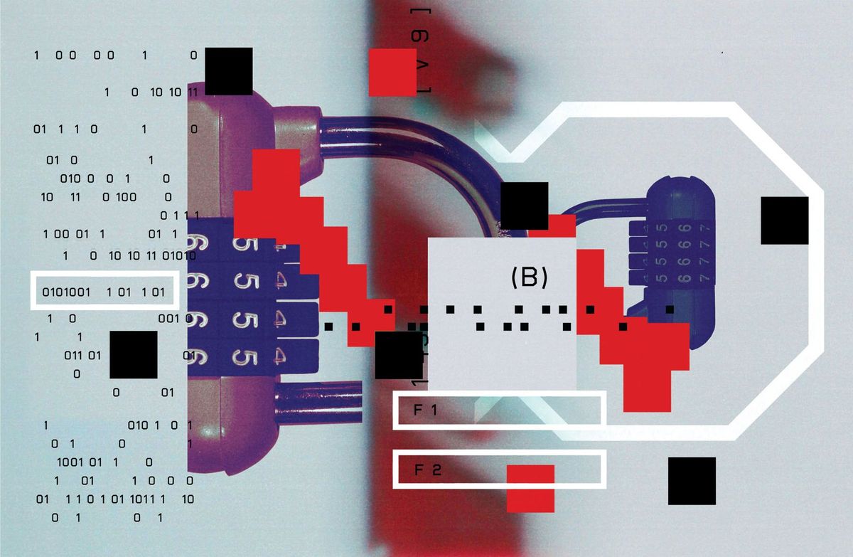
When color LCDs began to replace CRTs, Microsoft developers realized they could take antialiasing one step further. If you hold a magnifying glass up to a color LCD monitor, you’ll see the rectangular red, green, and blue subpixels that make up each pixel; a 5-by-5-pixel grid contains 25 pixels but 75 subpixels [see figure, "Color Coding"]. When turned up to maximum intensity, these colors trick the eye into seeing a white background.
 Color Coding: Microsoft’s ClearType technology manipulates the red, green, and blue subpixels on a color LCD panel to gain extra resolution. The image above is how ClearType text appears when you view it through a magnifying glass.Microsoft
Just as antialiasing involves manipulating the intensity of individual pixels, type developers figured out a way to manipulate the intensities of individual subpixels. To render a line that is only a fraction of a pixel wide, they illuminate only the appropriate subpixels—in effect, increasing the text resolution. Microsoft introduced this technique of subpixel rendering in 1998 under the name ClearType.
The latest version of ClearType, included with Windows Vista, pays attention not just to individual letters but to the spacing between letters. Previously, with “reading” size text of 10 or 12 points, we could place either 1 pixel in between letters, which was often too little, or 2 pixels, which was often too much. Using the extra resolution in the subpixels, we can now have fractional spacing, which improves the evenness and symmetry of the entire page [see figure, " Trading Spaces"].
 Trading Spaces: The latest version of Microsoft’s ClearType text-rendering technology allows fractions of pixels between letters, which improves the readability of the entire page, as seen in the before and after examples above.Microsoft
There are other approaches to onscreen type, of course. While Microsoft stresses hinting to improve onscreen rendering, Apple and Adobe have focused on making the onscreen text as faithful to the printed output as possible. Instead of hinting letters, which slightly distorts the letter shape, they perform antialiasing on the letter outline, with slight stem-weight adjustments. The result is that when you look at a page of text onscreen, the text will have a very smooth, even appearance, much like the printed page. The tradeoff is that the individual letters are less crisp and therefore more difficult to read onscreen.
Ultimately, to make reading onscreen truly equivalent to reading from the page, you need to solve the problem of portability. No one wants to be tied to a desk or have to lug around a laptop just to do some light reading. People want the freedom and flexibility to read lying down on their sofas, standing up in the subway, or while smearing cream cheese on a bagel in their breakfast nooks. Developments in tablet PCs, electronic books, and electronic paper show promise, but weight, screen resolution, and power consumption still have a long way to go.
Sony’s Portable Reader, for instance, is a lightweight electronic book device that relies on an e-paper display from Cambridge, Mass.–based E Ink Corp. Unlike an LCD, it can be easily read even in bright sunlight. Because the display draws power only when the image changes, power consumption is low.
But e-paper can’t display moving images or colors, so it’s mainly suited only for niche products like the Reader and similarly static applications. Laptops, cellphones, and other products will likely continue to use LCDs for the foreseeable future.
Having gone to such lengths to make computer text reader-friendly, how do we know it’s working? When software developers try to gauge the effectiveness of a programming upgrade, they typically look at whether or not users can accomplish tasks they couldn’t do previously. Because users are already comfortable with the basic task of reading, we instead try to measure things like reading speed and comprehension.
We know from past studies and our own experience that emotions have a powerful effect on behavior. For instance, when people receive a small gift or watch a funny video, their mood improves and they then perform better on creative cognitive tasks. So we decided to investigate whether good typography could similarly improve performance on these same tasks.
Mastering the Candle Task
 Trick Candle: In this cognitive test, subjects are given a candle, a box of tacks, and a match and have to figure out how to attach the candle to a corkboard on the wall and then light it without dripping wax onto the floor.Microsoft
We asked people to read either a high-quality or a poor-quality onscreen magazine. The content in both cases was an issue of The New Yorker. The high-quality sample used a version of The New Yorker’s font that had been enhanced using Microsoft’s ClearType font-rendering technology, as well as good hyphenation and justification. The poor-quality sample used a bitmap version of Courier, a font designed for typewriters, and had two points of space inserted between words. People in both groups reported that they enjoyed reading the onscreen magazine (they were reading The New Yorker, after all). But there was a difference.
After the groups finished reading, we had them perform the Candle Task, a well-known psychological test developed by Karl Duncker in 1945. Subjects were given a candle, a match, and a box full of thumbtacks [see photo, "Trick Candle"]. Their task was to affix the candle to a corkboard so that it wouldn’t drip wax onto the floor when lit. (The solution appears at the end of the article.)
Among those who read the high-quality text, a greater proportion were able to solve the task than in the group who read the poor-quality version; the boost in cognitive ability was about the same as if they’d been given a small gift.
Peer-reviewed studies have consistently found that using ClearType boosts reading performance compared with other text-rendering systems. In a 2004 study, for instance, Lee Gugerty, a psychology professor at Clemson University, in South Carolina, measured a 17 percent improvement in word recognition accuracy with ClearType. Gugerty’s group also showed, in a sentence comprehension study, that ClearType boosted reading speed by 5 percent and comprehension by 2 percent. Those results were unusual because, typically, any gain in reading speed decreases comprehension.
Similarly, in a study published last year, psychologist Andrew Dillon at the University of Texas at Austin found that when subjects were asked to scan a spreadsheet and pick out certain information, they did those tasks 7 percent faster with ClearType.
A good way to measure a font’s readability is to conduct a visual acuity exam, which is similar to the eye test you have to pass to get a driver’s license. In one such study, James Sheedy, while he was an optometry professor at Ohio State University, in Columbus, compared various computer fonts to see which was the most readable. He concluded that Verdana is more legible than two other popular fonts, Georgia and Arial, and in turn Georgia and Arial are more legible than Times New Roman, which had been designed for The Times of London back in 1931.
Sheedy’s results confirmed what we already believed to be true about onscreen legibility: among these four typefaces, Verdana, which was specifically developed for computers, has the largest lowercase letter heights and the most generous spacing inside and between letters, while Times New Roman has the smallest lowercases and the least generous spacing.
Mystery of the Scrambled Words
 Shape Shifter: People don’t recognize words by their shapes. If they did, you wouldn’t be able to read a misspelled word, which has a different shape from its correct form.Microsoft
In September 2003, the following paragraph thundered its way around the Internet:
Aoccdrnig to rscheearch at Cmabrigde uinervtisy, it deosn’t mttaer waht oredr the ltteers in a wrod are, the olny iprmoetnt tihng is taht the frist and lsat ltteres are at the rghit pclae. The rset can be a tatol mses and you can sitll raed it wouthit a porbelm. Tihs is bcuseae we do not raed ervey lteter by itslef but the wrod as a wlohe.
Like everyone else, I remain amazed at how easy it is to read this paragraph. It certainly is a testament to the flexibility of the human mind. But the paragraph’s main points—that we use only the first and last letters of a word when reading and that we read by recognizing whole words—are actually false. Here’s why.
For one thing, the letter transformations in the paragraph are not random. If the letters are moved any further from their original location, the words become much more difficult to read, as we can see in the following phrase:
Anidroccg to rcraeseh at Cgdirbmae utisreviny
As for recognizing words by their shapes, the letter transformations in misspelled words usually alter the pattern of ascending and descending letters and thus their shapes [see figure, "Shape Shifter"]. If anything, the scrambled paragraph suggests that word shapes are not important, because we can still readily recognize the transformed words despite changes in their shapes. In fact, the consensus among psychologists who study reading is that we recognize words not by their shapes but by looking at letters within a word in parallel.
A literate adult reads at such a fast pace that it may seem as if the misspelled words have no effect. It only takes a couple of hundred milliseconds to recognize a correctly spelled word, so a 10 percent or even a 100 percent increase in recognition time would hardly be noticeable. But research by Keith Rayner and his colleagues at the University of Massachusetts, Amherst, has demonstrated that people do read about 12 percent slower with the kinds of misspellings in the scrambled paragraph.
Sadly, the scrambled paragraph has now entered the realm of urban myth and continues to circulate online. Should anyone send it your way in the future, you can confidently reply that its conclusions are just as scrambled as the text.
But we’ve also found that you can’t always judge how successful a reading technology is just by looking at reading speed and comprehension. In one study, we had subjects peruse documents with good page layouts and bad layouts. In the bad layout, readers had to jump over an image to keep reading across the line, while in the good layout, the image didn’t interfere with the text. While readers said they preferred the nicer layout, they exhibited no differences in reading speed or comprehension.
So we’ve started developing new methods for measuring onscreen reading. One promising area involves looking at how emotions affect behavior. For instance, when people receive a small gift, their mood improves, and they perform better on cognitive tasks. We wondered if the “pleasure” of reading a well-rendered screen of text would also enhance performance. Amazingly, it does. [See sidebar, "Mastering the Candle Task."]
More recently, we’ve found physical evidence of these emotional effects by measuring facial muscles associated with smiling and frowning. We reran the page layout test in which we’d previously failed to detect any differences in reading speed or comprehension; this time, though, we found that people frowned more when reading the poor page layout. If bad layouts are affecting their moods, even subtly, that could in turn decrease their overall productivity.
In ongoing research sponsored by Microsoft, Keith Rayner at the University of Massachusetts, Amherst, is studying the impact of ClearType and other technologies on eye movements. When we read, we perceive that our eyes move smoothly across the line of text, but they actually are making jumps from word to word—fixating on a word for 250 to 300 ms, then making a quick movement to the next word. [For more on how we read, see sidebar, "Mystery of the Scrambled Words."]
As type designers and engineers continue to develop new and better technologies to render onscreen text, and psychologists continue to study their effectiveness, we eventually hope to make it as easy and comfortable to read from the computer screen as it is from the page. Reaching such a goal will not only make us more productive but also help preserve literacy and spread the world’s knowledge. It might even save a few trees, too.
Solution to the Candle Task
Empty the tacks from their box, and then tack the empty box to the corkboard. Place the candle inside the box and light it; the wax will stay in the box.